CSS provides plenty of flexibility for you to design appealing, responsive layouts. A magazine-style layout organizes mixed text-and-image content in an attractive, eye-catching format, making it a popular choice.
CSS Grid gives you the tools and fine-grained control you need to achieve this layout, so it’s a great technique to learn.
What Are Magazine-Style Layouts?
Magazine-style layouts use a grid-like structure to arrange content in columns and rows.
They are great for displaying different types of content like articles, images, and ads in an organized and appealing way.
Understanding CSS Grid
CSS Grid is a robust layout tool that lets you position elements in two-dimensional space, making it easy to create columns and rows.
With this type of layout, two primary components come into play: the grid container, responsible for defining the grid's structure, and the grid items, which are the child elements of the container.
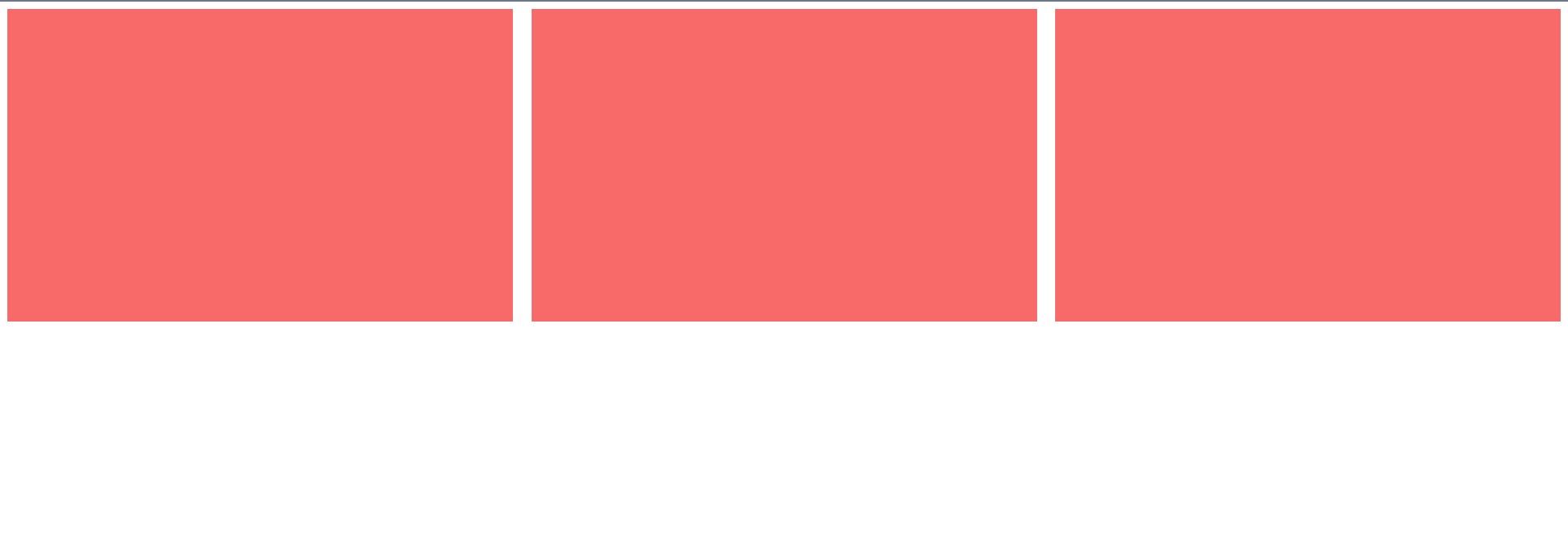
Here's a simple example of how you can use CSS Grid to create a 3x3 grid:
 .grid-container {
    display: grid;
    grid-template-columns: repeat(3, 1fr);
    gap: 20px;
}

.grid-item {
    background-color: #f76a6a;
    padding: 20px;
}
This code defines a grid container with three columns of equal width and a 20px gap between items. Here’s the result:
Setting Up the HTML Structure
For a magazine-style layout, you'll need a well-structured HTML document. Consider using semantic elements to organize your content like <article> and <section>. Here's a good starting point:
 <body>
    <section class="magazine-layout">
        <article>
            <img src="https://source.unsplash.com/random/?city,night" />
            <p>Some Article Title</p>
        </article>

        <article>
            <img src="https://source.unsplash.com/random/?city,day" />
            <p>Some Article Title</p>
        </article>

        <article>
            <img src="https://source.unsplash.com/random/?animal" />
            <p>Some Article Title</p>
        </article>

        <article>
            <img src="https://source.unsplash.com/random/?book" />
            <p>Some Article Title</p>
        </article>

        <article>
            <img src="https://source.unsplash.com/random/?food" />
            <p>Some Article Title</p>
        </article>
    </section>
</body>
Defining the Grid Container
To create a grid for your magazine-style layout, add the following CSS code:
 .magazine-layout {
    height: 100%;
    max-width: 130rem;
    margin: 0 auto;

    /* Defines the grid container */
    display: grid;

    /* Defines the column specification */
    grid-template-columns: repeat(auto-fit, minmax(250px, 1fr));

    /* Defines the row specification */
    grid-template-rows: repeat(auto-fit, minmax(250px, 1fr));
    gap: 2rem;
    padding: 2rem;
}
This CSS specifies that the container element, .magazine-layout, is a grid container using the declaration display: grid.
The grid-template-columns and grid-template-rows properties use a combination of repeat, auto-fit, and minmax. These ensure that column widths and row heights are at least 250px, and as many items as possible fit in each.
Placing Grid Items
Now style each article and its contents to create attractive thumbnail-style elements:
 article {
    overflow: hidden;
    border-radius: 0.5rem;
    position: relative;
    color: #fff;
}

.article img {
    width: 100%;
    height: 100%;
    object-fit: cover;
    display: block;
    max-height: 400px;
}

.article p {
    position: absolute;
    bottom: 0;
    left: 0;
    padding: 2rem;
    background: #333333c1;
    font-size: 2rem;
    border-radius: 0.5rem;
}
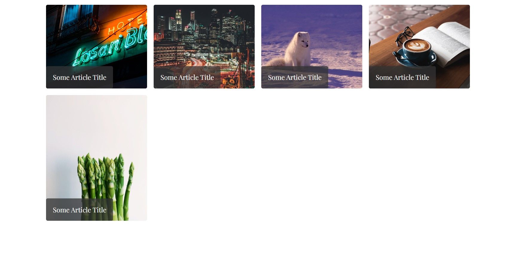
At this point, your webpage should look something like the following:
Creating Magazine-Style Layouts
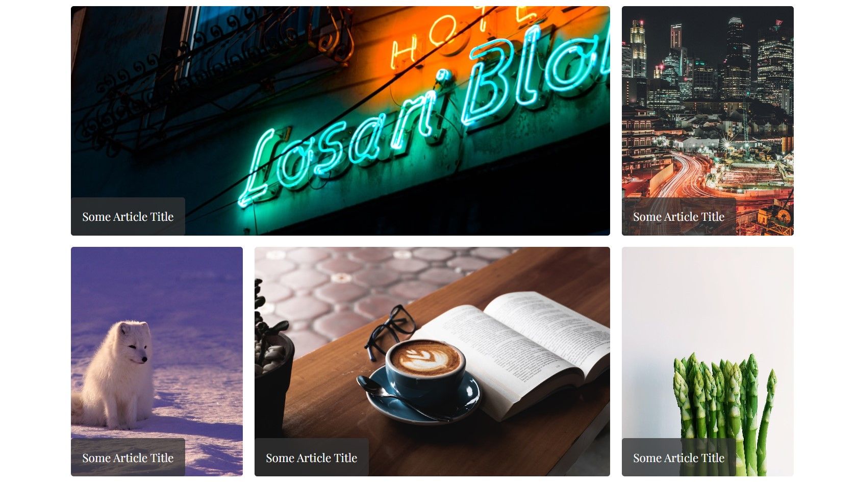
To achieve a true magazine-style look, add CSS styles to span the article elements in any order you wish:
 .article:nth-child(1) {
    grid-column: 1 / span 3;
}

.article:nth-child(4) {
    grid-column: 2 / span 2;
}
Your page should now look like this:
Responsive Design With CSS Grid
One of the advantages of CSS Grid is its inherent responsiveness. You can use media queries to adjust the layout for different screen sizes. For example:
 /* Media query for screens up to 1100px */
@media screen and (max-width: 1100px) {
    .article:nth-child(3) {
        grid-column: 2 / span 2;
    }

    .article:nth-child(5) {
        grid-row: 3 / span 1;
    }
}

/* Media query for screens up to 600px */
@media screen and (max-width: 600px) {
    .article:nth-child(2),
    .article:nth-child(3),
    .article:nth-child(4),
    .article:nth-child(5) {
        grid-column: 1 / span 3;
    }
}
These media queries switch between multiple layout definitions to best suit the device screen size. Your final layout will adapt to different sizes:
Transforming Your Layouts With CSS Grid
CSS Grid is a flexible tool you can use to create magazine-style layouts that adjust to different screen sizes. It lets you define grid structures, place items, and adjust layouts.
Experiment with different grid configurations and styles to achieve the perfect magazine-inspired layout for your website.


